Sunshine State
Scope: Logo Design
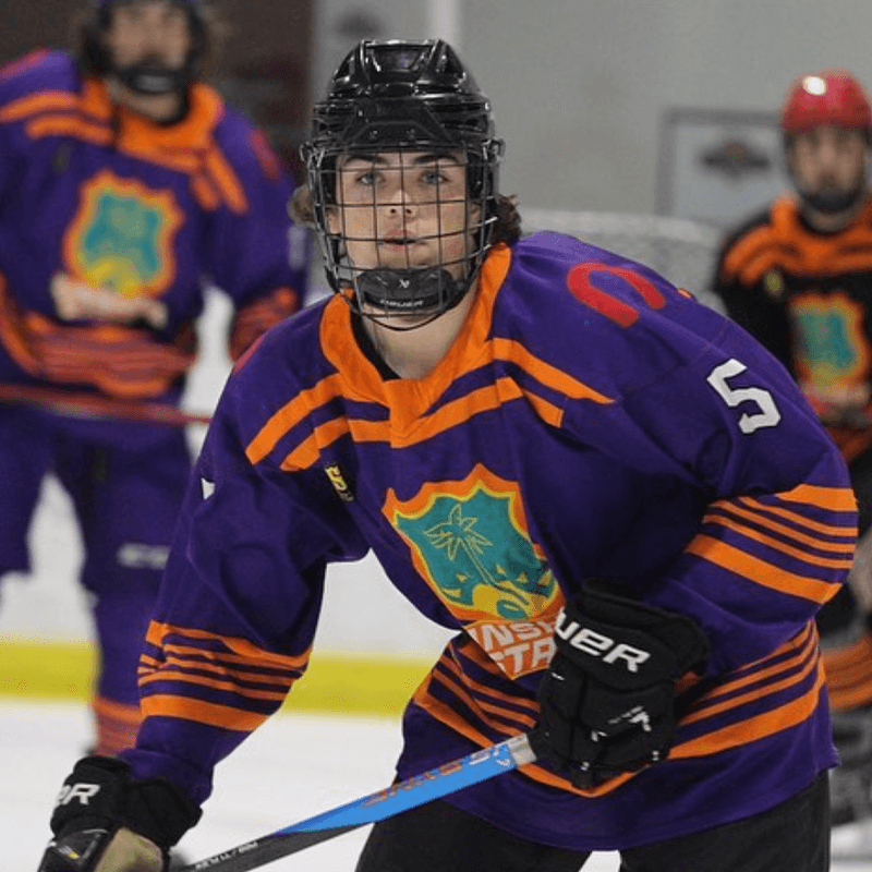
The Sunshine State League is the preeminent summer hockey development league in South Florida, dedicated to the cultivation of talent from junior hockey to the semi-professional players.
About This Project
Our Services for Sunshine State League
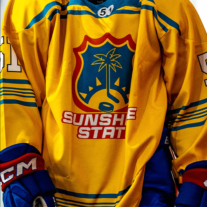
As the league evolved, it was essential for the logo to reinforce its status as South Florida’s premier hockey league. By incorporating elements from the existing logo, our design approach was committed to preserving its original essence while elevating it to reflect the vibrant South Florida landscape. This was achieved by integrating motifs of the sun, palm trees, and the leisure associated with sport play in a tropical setting.

Original logo

Redesigned logo
The Sunshine State logo maintains its classic shield shape with refined stroke lengths and harmonized tones. The hockey puck, preserved from the original design, is now positioned at an angle above the ‘SUNSHINE’ border, adding depth and dimension while symbolizing a dynamic slap shot. The hockey stick, also retained, has been evolved to incorporate a palm tree, nodding to the South Florida landscape. A new element, the rising sun, is introduced to embody the league’s name ‘Sunshine State’ and further connect with the South Florida environment. The updated text features striking, razor-sharp edges that evoke the brilliance of the sun’s rays and the precision of hockey skates. Additionally, the color scheme has been refined to eliminate gradients, ensuring the logo’s scalability and printability.

Sunshine Yellow
HEX:#FCB514
RGB: (252, 181, 20)
CMYK: (0, 28, 92, 1)
PANTONE: PMS 1235 C

Morning Orange
HEX:#EB6E1F
RGB: (235, 110, 31)
CMYK: (0, 53, 87, 8)
PANTONE: PMS 158 C

Pompano Teal
HEX:#006778
RGB: (0, 130, 120)
CMYK: (100, 14, 0, 53)
PANTONE: PMS 3155 C

Ice White
HEX:#FFFFFF
RGB: (255, 255, 255)
CMYK: (0, 0, 0, 0)