Solutions
Scope: Logo Design, Brand Strategy
Solutions is a field maintenance service based in Fort Lauderdale, FL. We specialize in providing contracted playing field maintenance for local colleges, high schools, and municipalities.
About This Project
Our Services for Solutions
Solutions, a distinguished field maintenance service based in Fort Lauderdale, FL, entrusted our esteemed marketing team with a refined yet pivotal endeavor: to craft a logo that embodies uniqueness, memorability, and exclusivity for their nascent enterprise.
Our dedicated team embarked on this mission by meticulously analyzing their business plan, engaging in multiple consultations to explore conceptual avenues, and ultimately delivering an exquisitely crafted logo designed to resonate profoundly with their audience.
Although Solutions is in its formative stage, it is poised to make a remarkable impact on the South Florida business landscape with its groundbreaking groundskeeping services.
Phase I: Core Elements & Logo Design
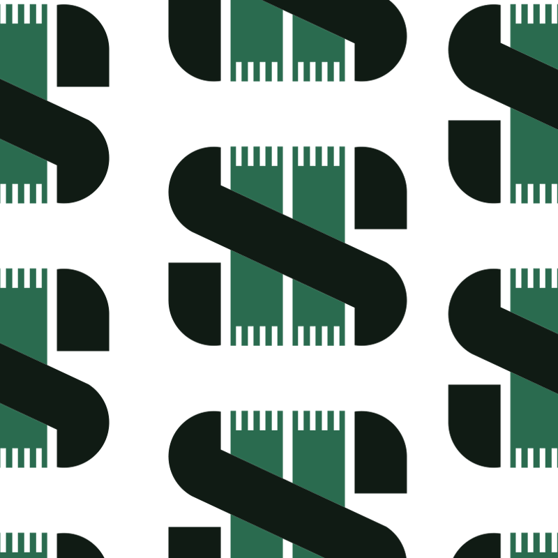
A visual overview of the logo’s inspiration & final design

The lines & field of American Football
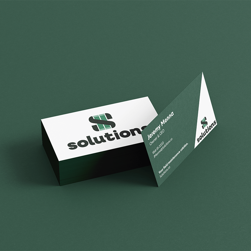
The Letter “S”
The logo, a masterful interplay of negative space, forms an elegant and powerful “S” that intimately wraps around the contours of an American football field. The sleek black “S” signifies strength, professionalism, and a commitment to excellence. Its seamless integration with the vibrant green field symbolizes a bond of trust and reliability, portraying Solutions as the guardian of every blade of grass, every pitch, and every game.

Bermuda Green
HEX:#28724F
RGB: (40, 114, 79)
CMYK: (29, 0, 14, 55)
PANTONE: PMS 555 C

Silver Blade
HEX:#C6CFD4
RGB: (198, 207, 212)
CMYK: (22, 12, 12, 0)
PANTONE: PMS 5455 C

Black Stone
HEX:#121E15
RGB: (18, 30, 21)
CMYK: (40, 0, 30, 88)
PANTONE: BLACK 3 C

Goal Line White
HEX:#FFFFFF
RGB: (255, 255, 255)
CMYK: (0, 0, 0, 0)
Phase II: Brand Story & Values
Where we give life, purpose and meaning to the company
In the world of Solutions, we understand that maintaining the integrity of playing surfaces is not merely a job—it’s a passion, a commitment to creating arenas where athletes can thrive and spectators can revel in the beauty of the game. Our brand story revolves around the values that Solutions upholds with unwavering dedication.
Trust: Our logo is a visual testament to the trust Solutions instills in its clients. The secure embrace of the “S” around the playing field represents the dependability and assurance that Solutions brings to every project. Trust is paramount.
Precision: Geometrically sound and aesthetically pleasing, our design reflects the precision and meticulous attention to detail that Solutions brings to the on-field services. Every line, every curve, and every aspect of our logo exudes excellence. Yet, the font choice reflects the friendly nature of the team.
Commitment: As stewards of nature, Solutions is committed to preserving and enhancing green spaces. The integration of the field within the logo symbolizes a commitment to the brans ability to service any playing field.
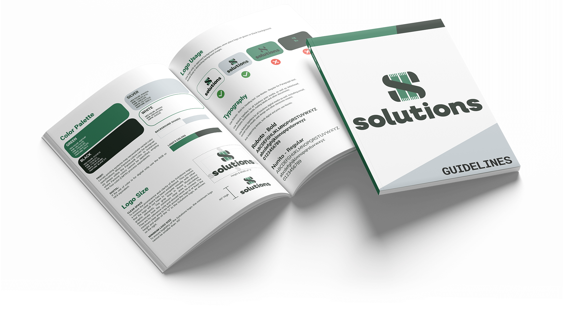
All excerpts as seen in Brand Guidelines.
Phase III: Brand Guidlines
Designed for optimum clarity.
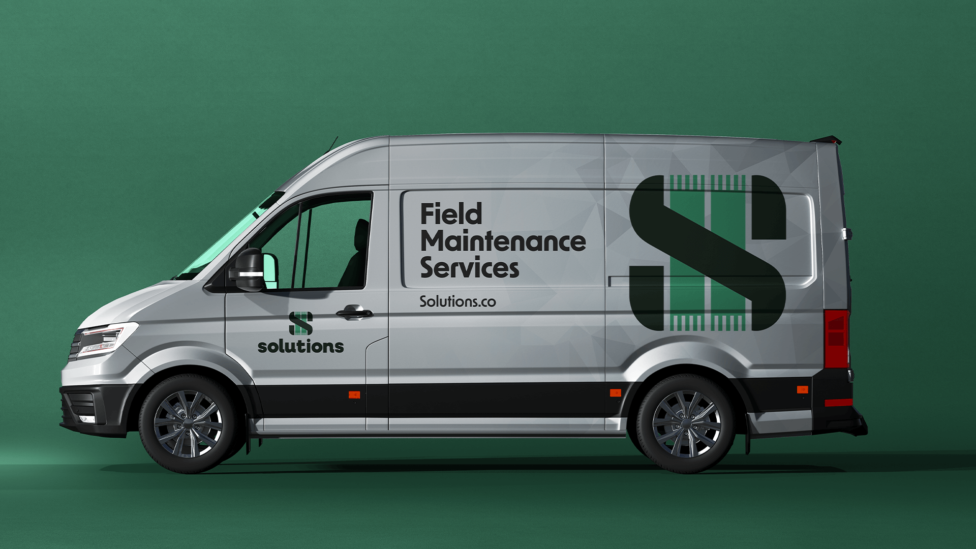
Phase IV: The Completed Look
The visuals of Solutions